Friday, September 26, 2014

12 Hue Color Square

September 2014

Art Element Focus:  Color

I decided to try something a little different to introduce color theory, a color SQUARE.
To reinforce vocabulary students were asked to write the words primary, secondary, and tertiary in the appropriate sections.  I think most everyone finally got a grip on how to pronounce tertiary.  This step really helped them to grasp the basics of color theory and learn the words.

These were painted with watercolor and inked with sharpie.

They look stunning in the hallway!


Saturday, September 20, 2014

Perspective in Space

September 2014

Art Element Focus: Space

We began this lesson with a brief discussion of space and the two meanings of the word.  The first was "outer space".  The second was space as it relates to art...the idea of creating a sense of three dimensions on a two dimensional surface.  We talked about surrealism and looked at some of Salvador Dali's artwork.  Most students had never heard of surrealism and were curious about the dreamy images. Next, I introduced one point perspective as a way to create the illusion of three dimensional space.  

Here is the process...

Step 1: Students followed step by step instructions to draw a room using one point perpective.  This was a guided lesson and took about 50 min.

Step 2:  They colored their room with markers and colored pencils.  Then, they cut out the doors, windows, and ceiling.


Step3:  They glued the room to black construction paper and drew a space background in the black shapes using colored pencil.

Step 4:  They were given magazines and cut out wacky pictures to add.  I showed them how to cut around the edge of the photo so that the images would actually look like they existed in the room. 

The wackier the better for this one!  The kids loved the having the opportunity to get silly snd be weird. Imaginations were soaring! Also, looking through the National Geographics brought up some interesting conversations.  


Wednesday, September 10, 2014

Shattered values

September 2014


This lesson focused on the art element of value (how light or dark an object is).

To prepare for this lesson, students practiced creating value scales on a worksheet.  We also talked briefly about cubism and looked at some of Picasso's artwork.

Steps for this project:

1. Students should make a simple line drawing of an object or symbol of their choice.
Keep the details to a minimum!

2.  Draw 10 wavy or straight lines through the drawing.

3.  In the resulting shapes students should create a separate value scale.  In other words, they should choose one side of the shape to make dark and gradually fade to light.

I gave them a choice to use charcoal or pencil.


Saturday, September 6, 2014

Graffuturism design

August 2014


This project focused on the art element of shape.  With line we can create an infinite variety of shapes.   The process is simple.  Draw at least 8-10 lines across the paper (wavy or straight).  They had the option of tracing shapes on top of the lines.  If the wanted to they could trace the lines with colored markers.  Then they colored the resulting shapes with colored pencils.  I asked them to color at least some of the shapes brightly.  Many students color so lightly with colored pencils that you can hardly see what color it is.  Yes, it takes a little work! We are learning that effort is directly connected to quality.

To introduce this project and to get them fired up, I showed them some paintings created by the artist Poesia Transcend.  He is an local, abstract graffiti artist and also the uncle of one of my students!  He came up with the word graffuturism as a term to describe this abstract style of graffiti.  Check it out at Graffuturism.com.

We talked about abstract art and how it does not depict anything we would see in reality.  This was a real eye opener because most of my students believe that good artists are those that can draw something that looks real.  Quite the contrary!  Good art can be created by using your intuition and simply doing what you feel.  This concept is exciting for many of my students who are under the impression that they are not "good at art"  because they can't make something look real.  

One of my students commented that this is the kind of art you would see in a museum.  Yes.  This is good stuff!


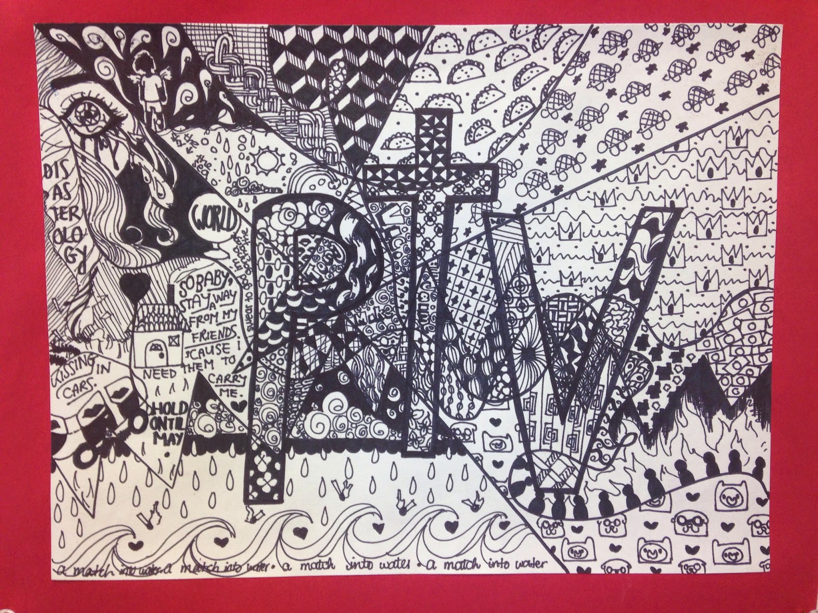
Hidden Initial Project

August 2014


 I have decided to focus more explicitly on the Elements of Art this year.  Our first seven lessons will focus on a specific art element.  

For this project we focused on line.  We talked about the many different types of lines.  Students completed a graphic organizer which helped them practice making lines and exposed them to the vocabulary associated with line (straight, curvy, zig zag, horizontal, etc).

Here are the steps to create this project:

1. Draw initials or a small word in bubble or block letters.

2. Draw several types of lines edge to edge through the letters.

3. Trace the letters and the lines with a sharpie.

4. In the resulting shapes draw different line doodles or patterns.  I made a handout of different zentangle designs to spark their imagination.  

5. Trace the doodles with a fine point sharpie.